 by
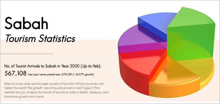
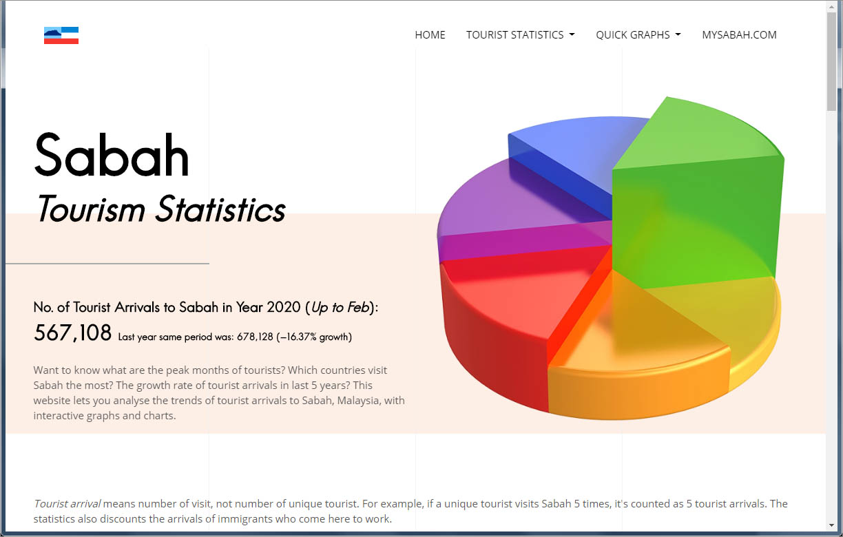
by Whenever you plan to start a business, you better base your decision on facts and figures. Sabah is doing quite well as a travel destination. Some individuals or companies would want to invest in this sector but need more statistics of Sabah tourists to analyze the domestic and international markets. As I work in tourism line, people would ask me the following questions from time to time.
- How many tourists visit Sabah last year?
- What are the peak months for travelers from different countries?
- Is our tourism growing in last five years?
- What countries are those tourists coming from?
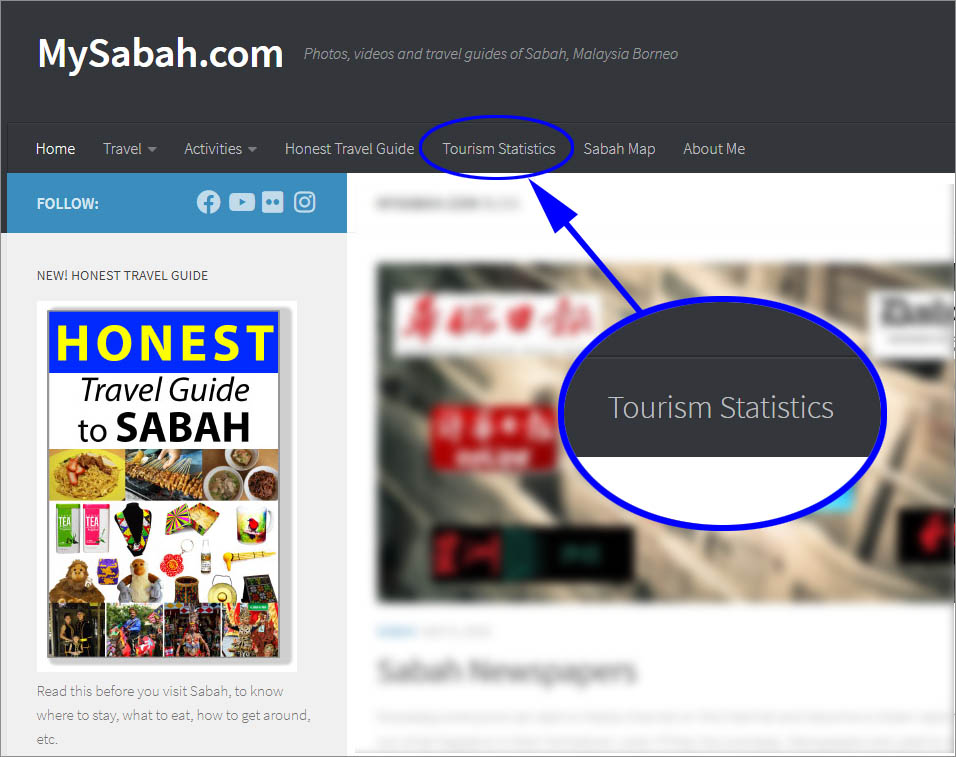
To answer these, in the past I needed to download the statistics from Sabah Tourism website and show you the numbers. Now, you can see all the figures and trends of Sabah tourist statistics in interactive graphs and charts in my website. Just click the “Tourism Statistics” in top menu of MySabah.com to explore.
There are four types of graphs in this statistics website.
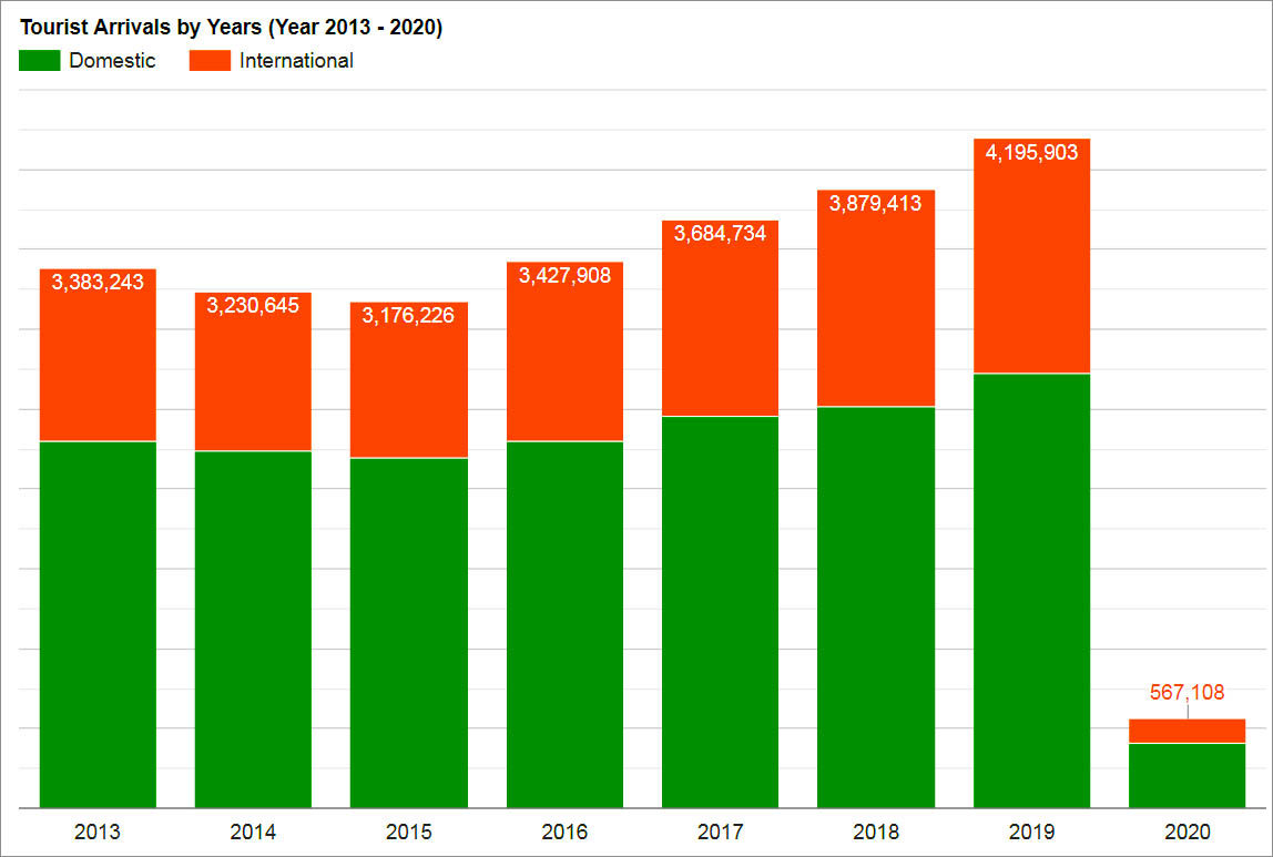
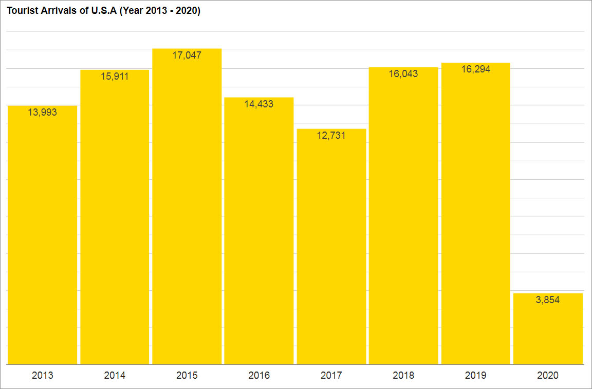
1. Tourist Arrivals over the Years
You can pick the year(s) you want to show the number or trend of domestic and international tourist arrivals of that period.
2. Tourist Arrivals by Country
Many are so curious when they see China or Korean tourists are everywhere and wonder exactly how many they are. You can check tourist arrivals from other countries such as Australia and UK too.
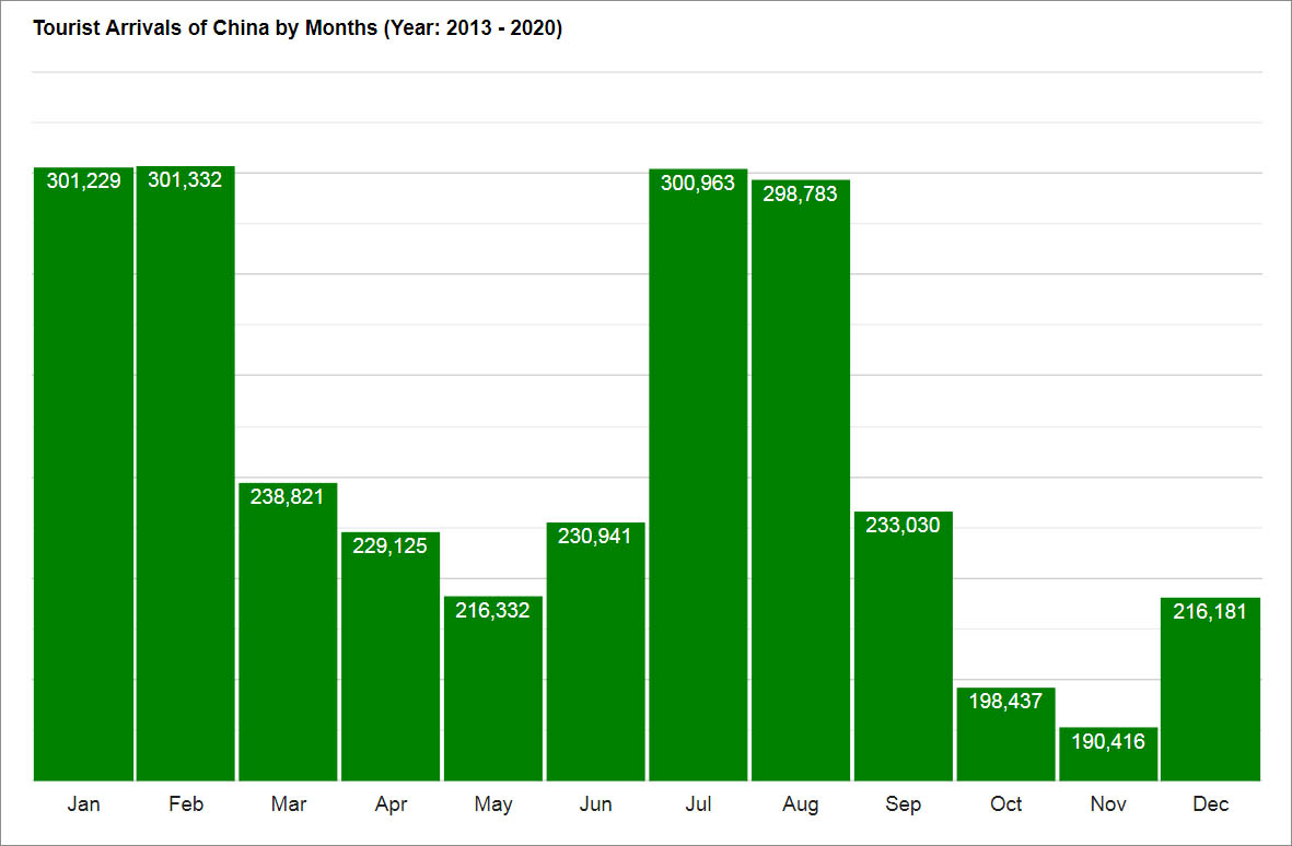
3. Tourist Arrivals by Months
You may notice some foreign tourists may appear more in certain months. This graph may match what you think. Overall, December is the peak month. October, April and May are really low season.

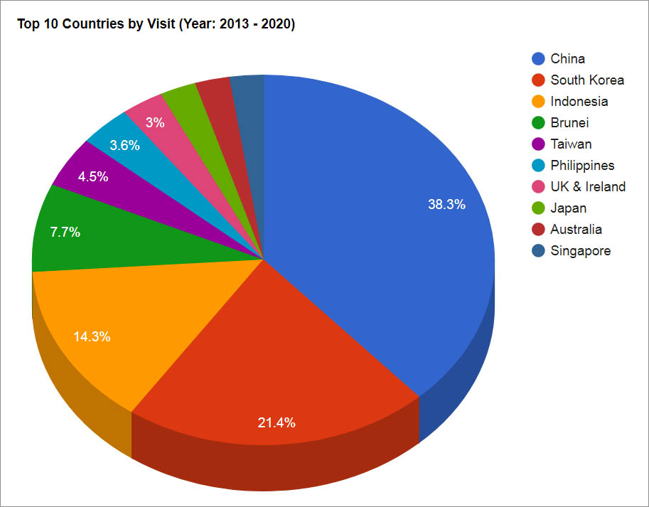
4. Top 10 Countries by Visit
This graph is fun and the result may surprise you. For example, pie charts of year 2013 and 2019 are quite different. Malaysia is not included in this pie chart.
Notes
- The term tourist arrivals means number of visits, not number of unique tourists. For example, if a tourist visits Sabah 3 times this year, it’ll be counted as 3 (not one) tourist arrivals this year.
- The statistics of China also includes tourists from Hong Kong and Macao.
- The numbers are mostly arrivals by air. Most immigrants who come to Sabah to work are not counted as tourist arrivals here.
- Some countries show 0 in graphs of older years, because they were not tracked in early year.
- The statistics starts from year 2013 to Feb 2020. I’ll pump new data once the numbers are available. The collection of monthly arrivals numbers usually take a few months, as it needs cooperation from a few agencies and government departments.
- The raw data of tourist arrivals is available for public access in Sabah Tourism website. You can check out other Infographics there.
This year Sabah travel industry is facing enormous challenge. I hope this tool can help you to see the big picture and to monitor the progress. You can’t control it if you can’t measure it. A business strategy which is not backed by numbers is a trash. Hey, these beautiful graphs add professional quality to your proposals and presentation too, so please use them.
What do you think? Is there any graph that you think we should add? Please share your ideas in comment section below.